A loud, fast Shopify theme for brands that want to be remembered. This guide covers setup, every section and block, and the questions we get asked most.
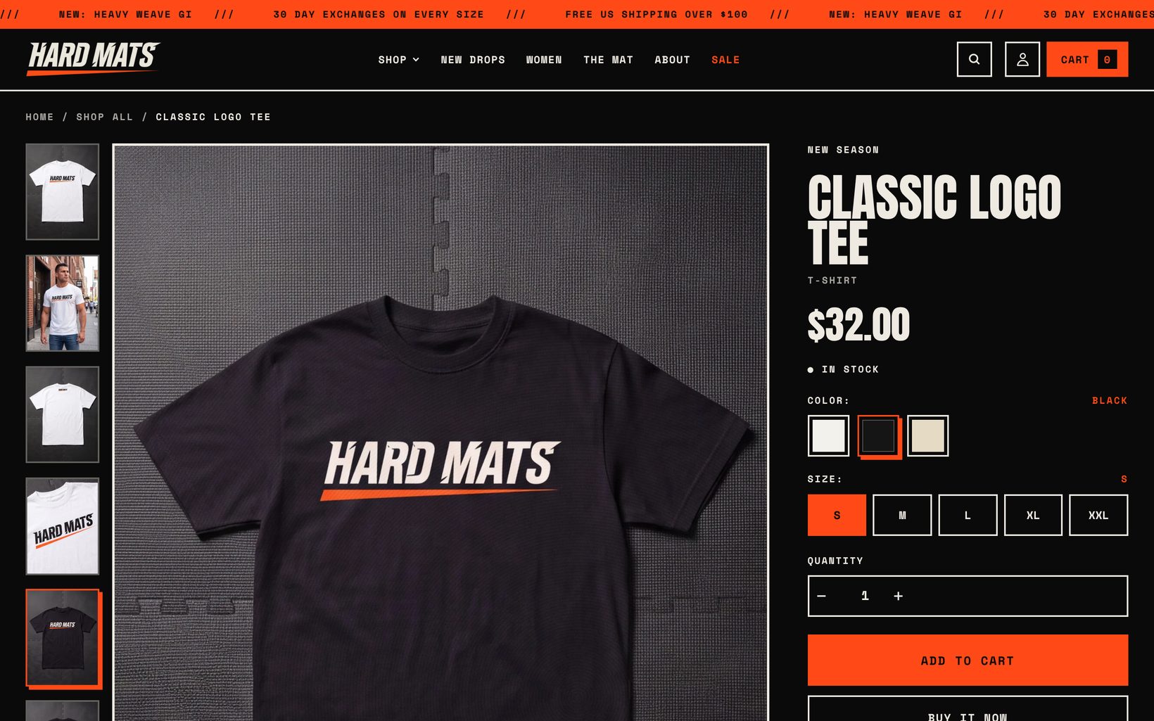
Getting started
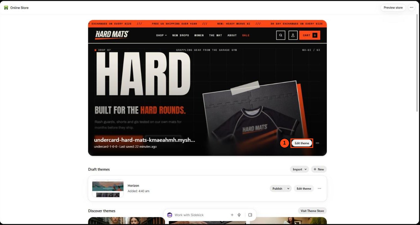
- Buy or try Undercard from the Shopify Theme Store. It appears in Online Store > Themes in your admin.
- Click Customize to open the theme editor. Your changes save as a draft until you publish.
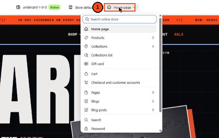
- Start in Theme settings (the brush icon): add your logo, pick colors and fonts, then work through each template from the dropdown at the top of the editor.
- When the preview looks right, click Publish.
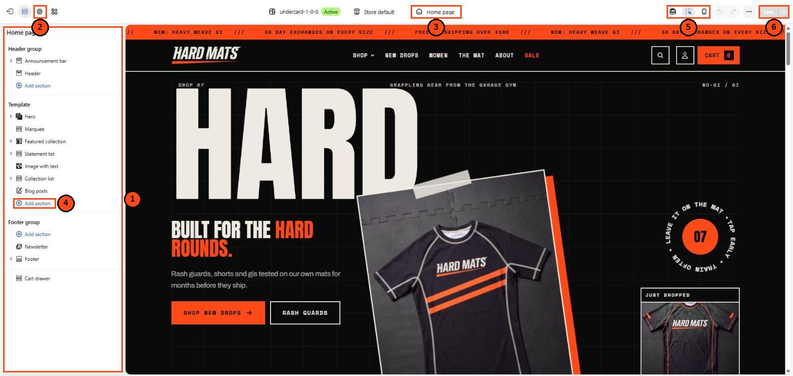
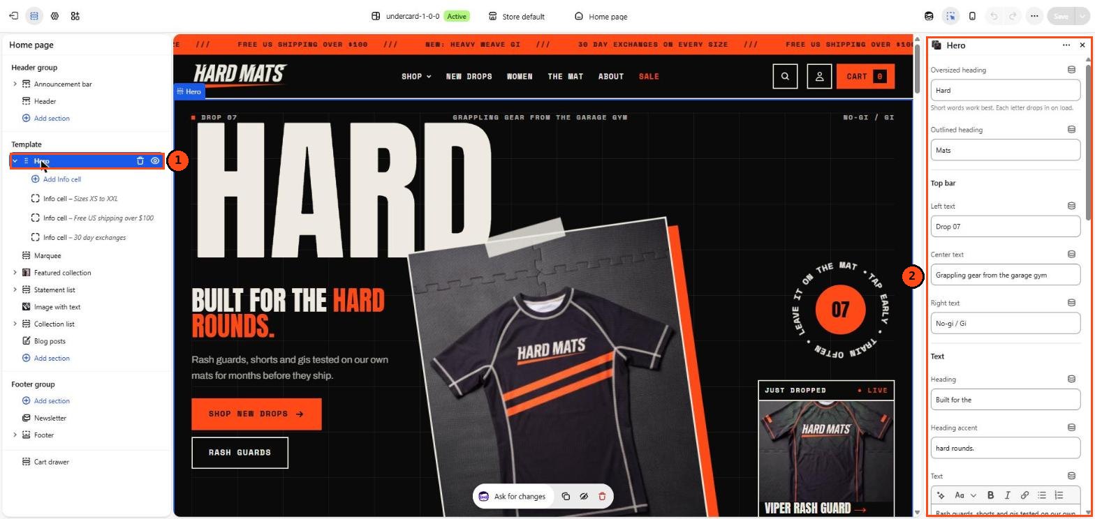
- Sections of the current template, grouped into header, template and footer
- Theme settings for logo, colors, fonts and more
- Template picker to switch to product, collection, cart and other pages
- Add section to the template
- Preview size for desktop and mobile
- Save your changes
Undercard is built for Online Store 2.0. Every page template is made of sections you can add, remove and reorder. Apps that support theme app extensions appear as blocks you can place inside sections.
Theme settings
| Group | What it controls |
|---|---|
| Logo and favicon | Logo image and height on desktop and mobile. With no logo, your store name is set in the heading font. |
| Colors | Five color schemes (Ink, Bone, Blaze, Panel and a light scheme with orange buttons). Every section has a color scheme setting. Edit a scheme once and it updates everywhere it is used. Badge colors use their own schemes. |
| Typography | Heading font (default Anton), body font (default Archivo) and an accent font for labels and buttons (default Space Mono). Heading scale, body scale and uppercase headings. |
| Layout | Page width, border width and the offset of the hard drop shadows. |
| Animations | Master switch for motion, smooth scrolling, cursor labels and the intro screen on the home page. Film grain can be turned off, placed on images only or over the whole page, and its intensity adjusted. Customers who prefer reduced motion never see animation. |
| Cart | Cart drawer or cart page, cart button label, order notes, free shipping progress bar and the drawer color scheme. |
| Product cards | Image ratio, second image on hover, quick add, vendor and product type labels, and the tag that shows a “New” badge. |
| Search behavior | Predictive search suggestions and prices in suggestions. |
| Social media | Links shown in the menu drawer and footer. |
| Currency format | Show currency codes next to prices. |
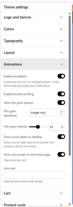
To find these settings:
- Open the theme editor
- Click the Theme settings icon in the top left bar
- Open a group, such as Animations, to change its settings
- Click Save in the top right corner
Header and footer

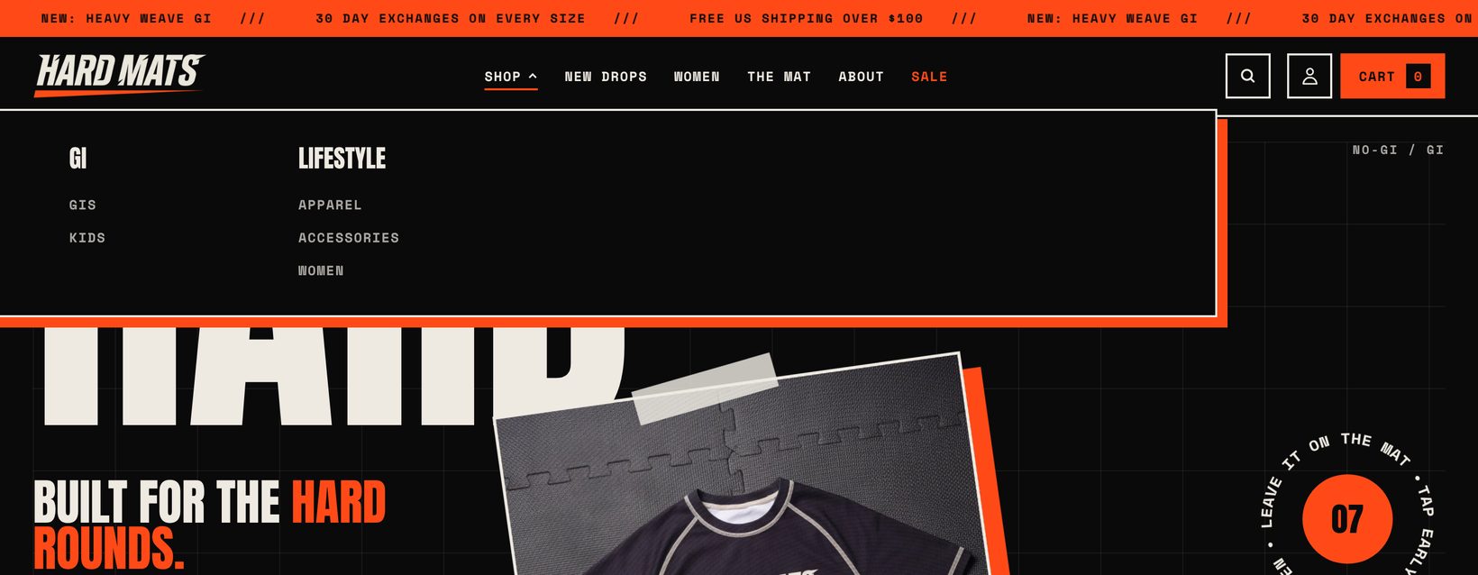
- Announcement bar with a scrolling marquee
- Logo image or your store name
- Main menu with dropdowns and mega menus
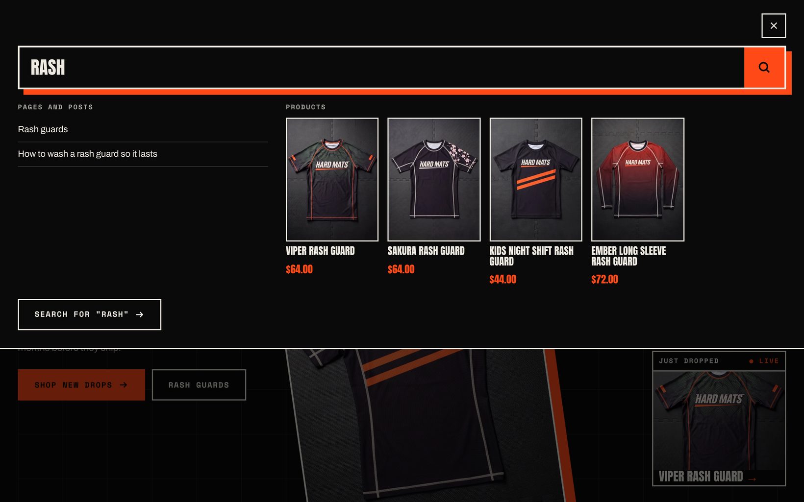
- Search with predictive results
- Cart opens the drawer or the cart page
Announcement bar
Add as many announcements as you like. Turn on scrolling for a marquee, or turn it off to show the first message only. Each announcement can link anywhere.
Header
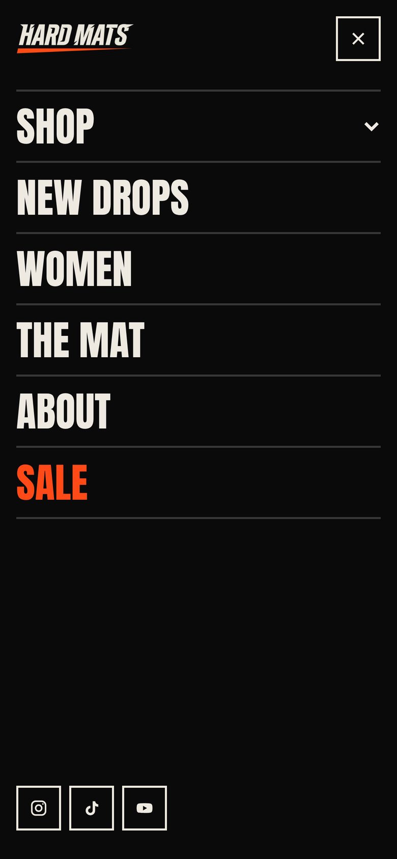
Choose a menu for the main navigation. Menus with two levels open as a dropdown and menus with three levels open as a mega menu. The header can stick to the top of the screen and hide while scrolling down. Customer accounts appear as a sign in button when accounts are turned on in Settings > Customer accounts. Country and language selectors appear in the mobile menu when you sell in more than one market or language.
Footer
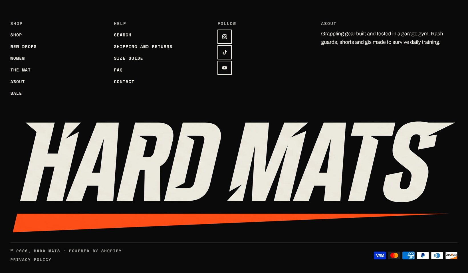
Add menu, text, social media and app blocks. The big wordmark at the bottom uses your store name, a custom text or an image. The Social media block can show a Follow on Shop button when Shop Pay is active. Country and language selectors, policy links and payment icons can be turned on or off.
Newsletter
The newsletter section sits in the footer group by default. Signups are saved as customers who accept email marketing.
Home page sections
Click a section in the sidebar to see its settings on the right. Drag sections to reorder them, or use the eye icon to hide one without deleting it.
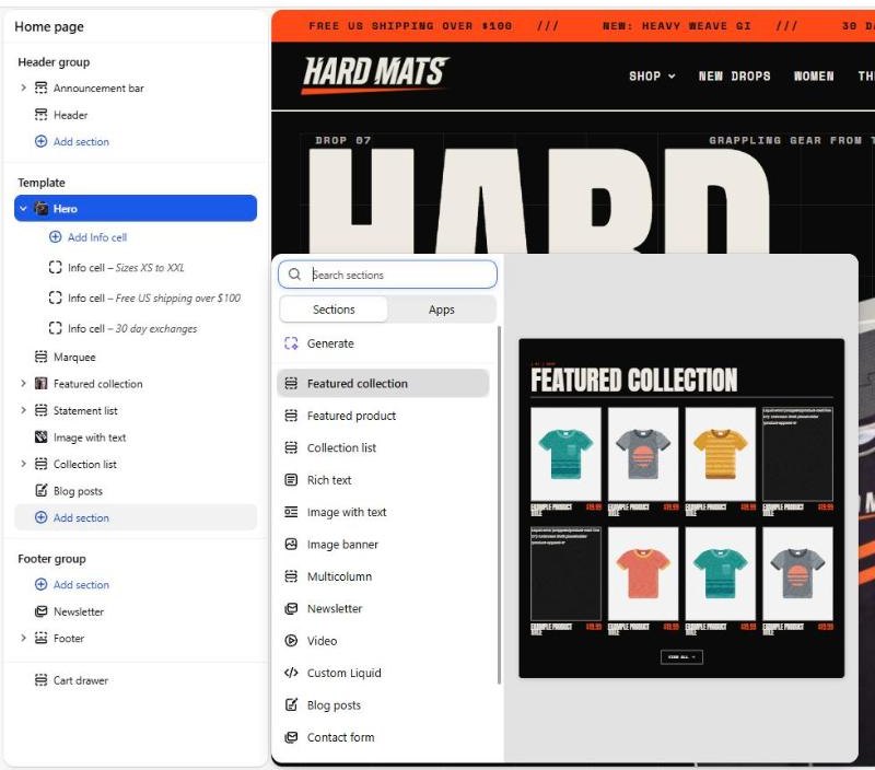
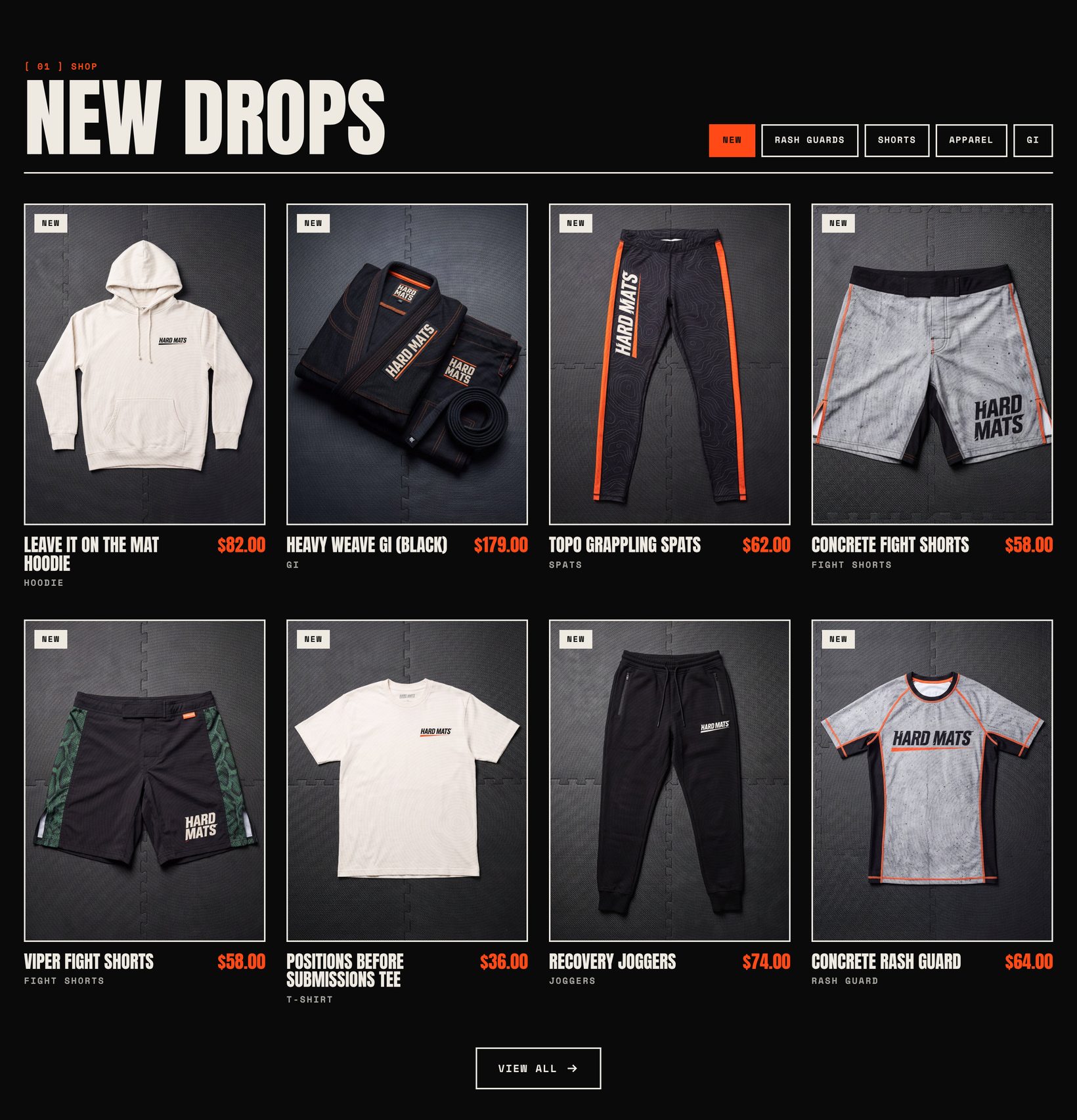
Every section in Undercard:
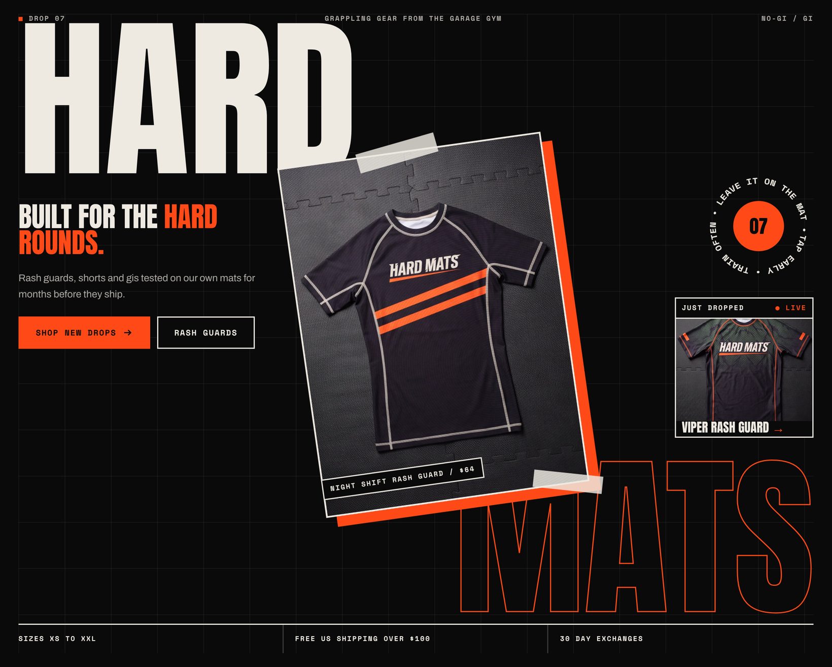

|.
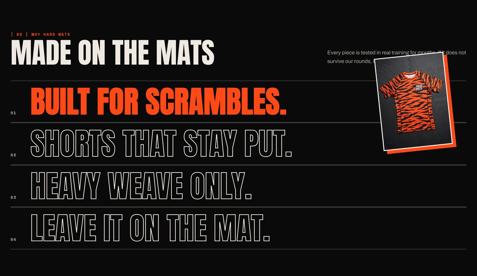
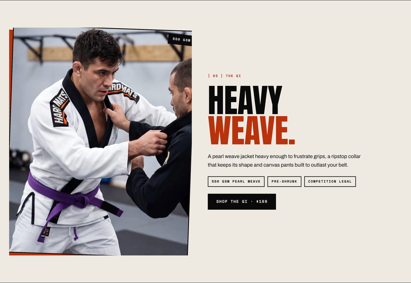
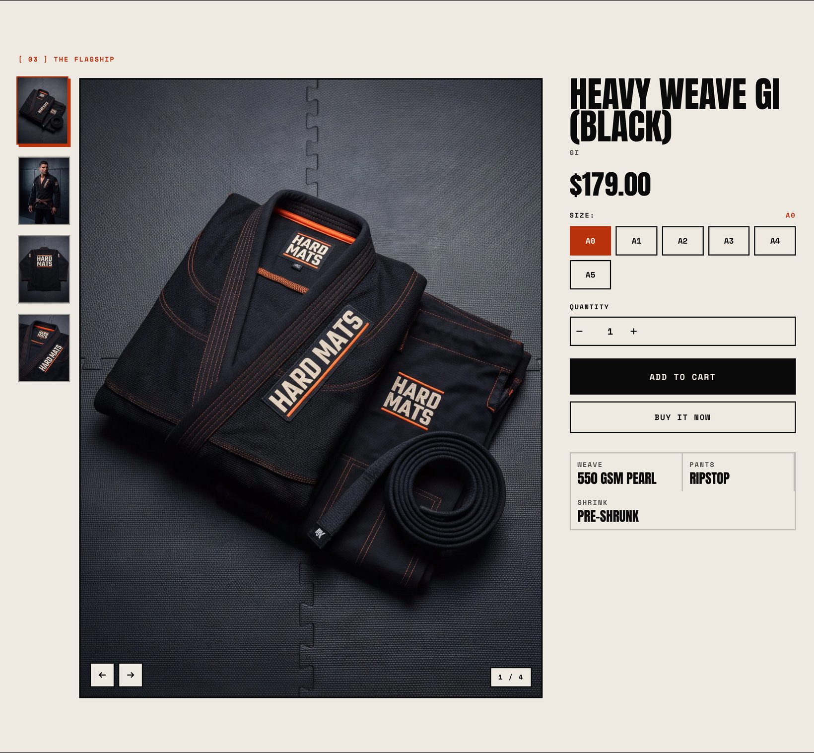
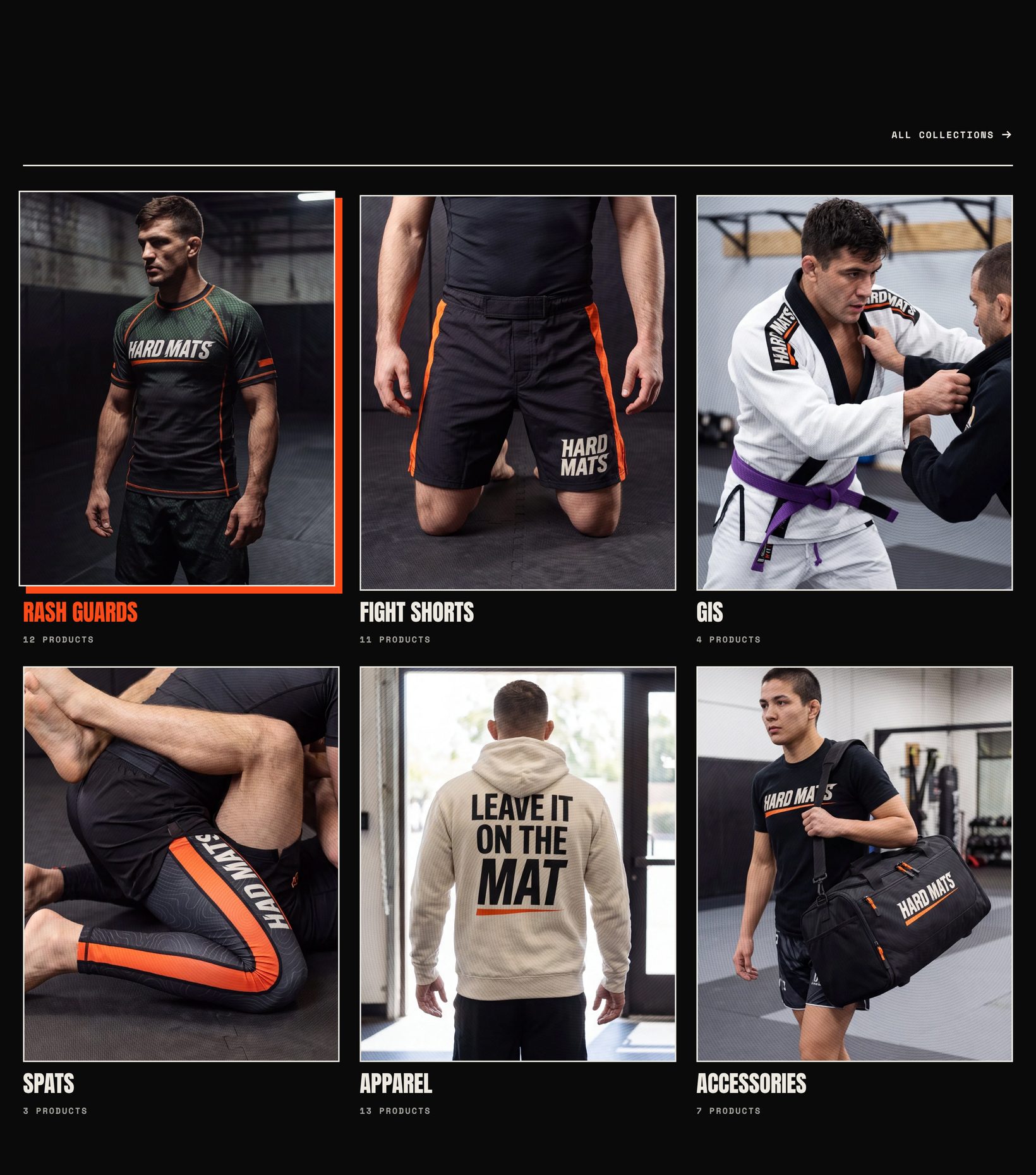
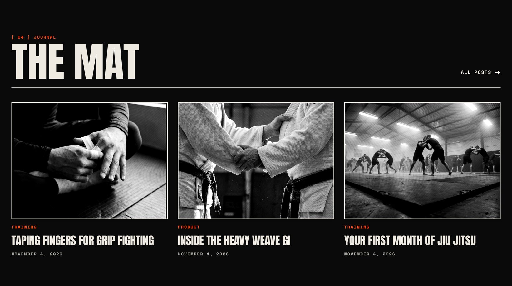
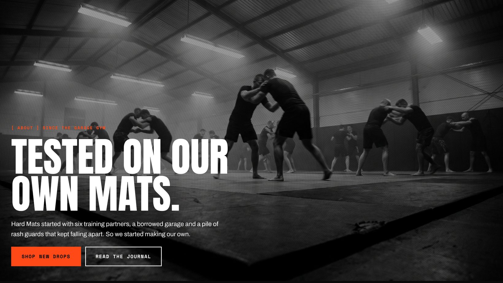
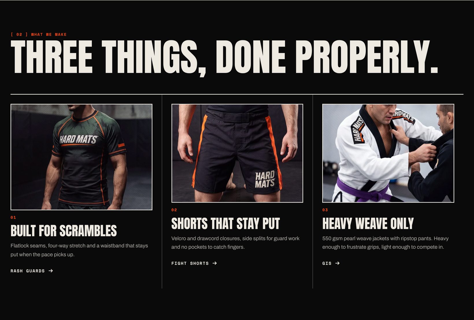
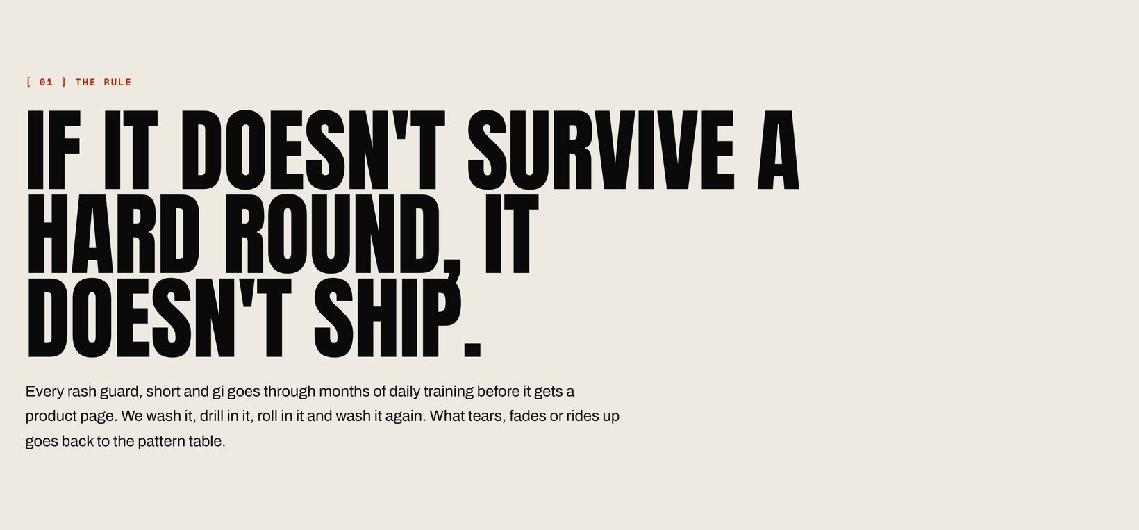
Also available: Video (uploaded, YouTube or Vimeo, with a cover image), Custom Liquid and Apps. Click any screenshot to see it full size.
Product page
The Product information section is built from blocks. Drag them into any order.
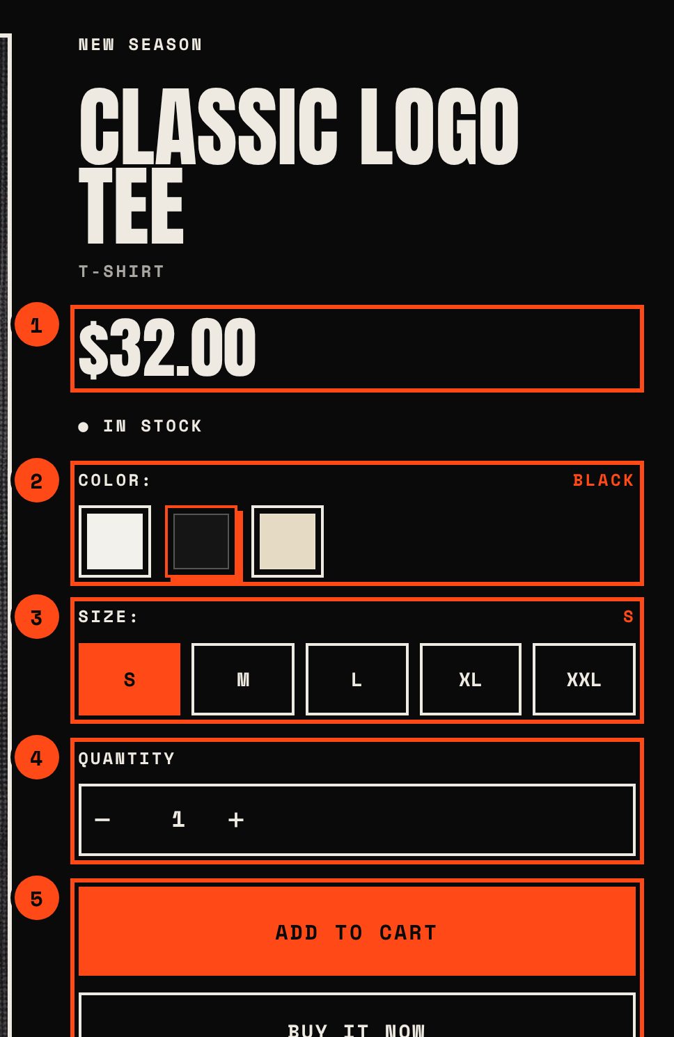
- Price with sale and unit prices
- Color with swatches from Shopify
- Size as buttons or a dropdown
- Quantity that respects quantity rules
- Buy buttons with dynamic checkout
| Block | Notes |
|---|---|
| Title, Text, Price, SKU, Inventory status | Price shows sale and unit prices, and tax and shipping notes. Inventory status warns when stock drops below your threshold. |
| Variant picker | Buttons or dropdowns. Color swatches appear automatically when an option uses Shopify’s swatch values (set in the product’s category metafields). Supports up to 2,048 variants and combined listings. |
| Quantity selector | Respects quantity rules and shows volume pricing for B2B customers. |
| Buy buttons | Add to cart, dynamic checkout buttons, Shop Pay Installments, subscription options, local pickup availability and the gift card recipient form. |
| Highlights | Up to three label and value pairs, such as fabric, fit and care. |
| Collapsible tab | Text or the content of a page, such as your size guide. |
| Complementary products | Products you pick in the Search and Discovery app, with quick add. |
| Share, Description, Custom Liquid, Apps | Native sharing on mobile, link copy on desktop. |
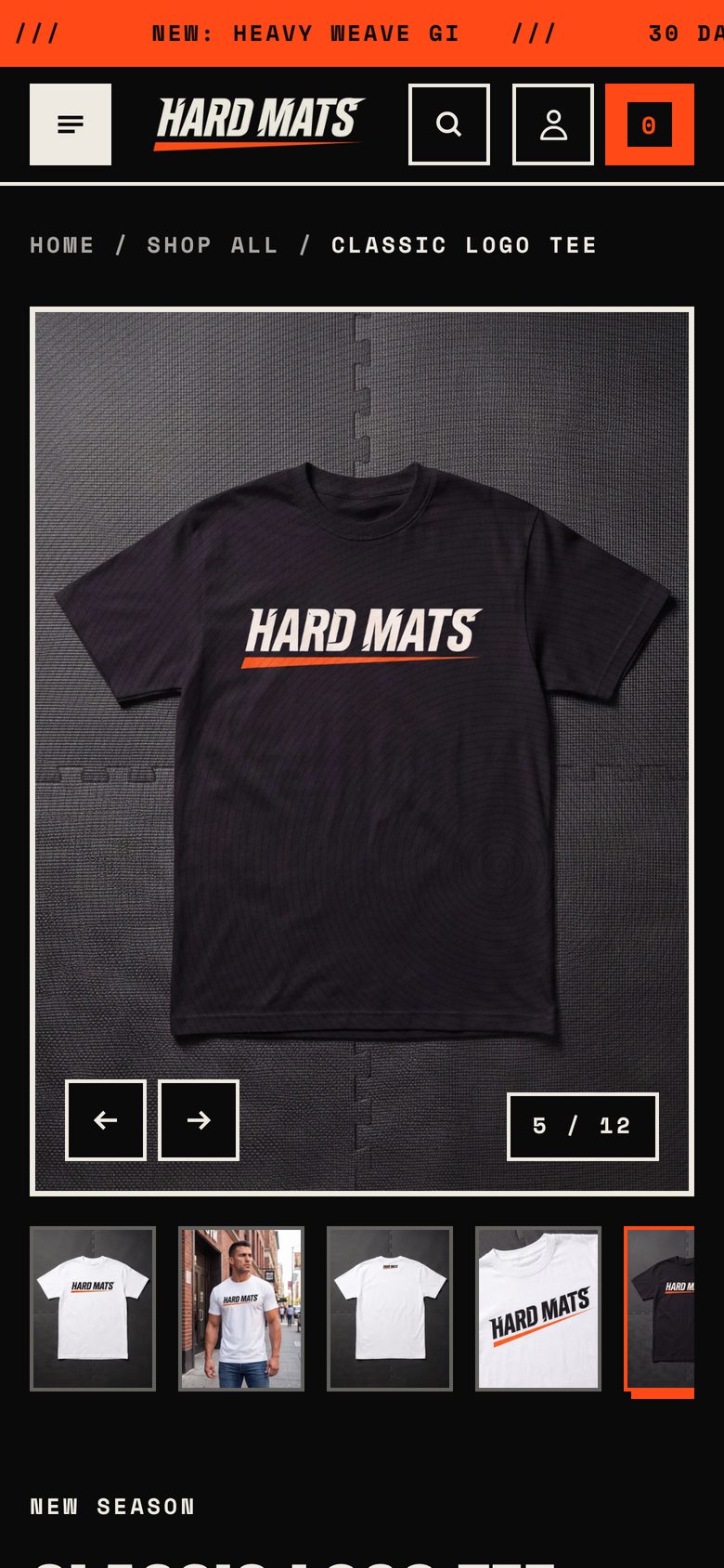
The media gallery supports images, videos, YouTube and Vimeo videos, and 3D models with “View in your space” on supported devices. Choose between thumbnails with a large image or a grid. When a customer picks a variant with its own image, the gallery jumps to it.
Collections and filters
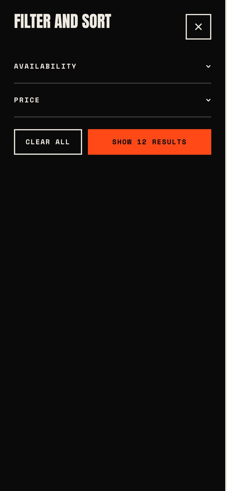
Filters come from the free Search and Discovery app. On desktop each filter opens as a dropdown in the toolbar. On mobile they move into a drawer. Filters, sorting and pagination update without reloading the page and keep the URL in sync, so the back button works. Color filters show swatches.
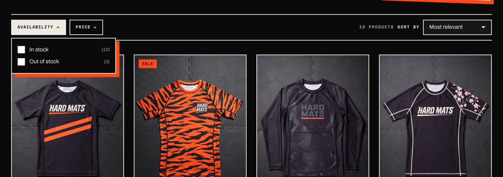
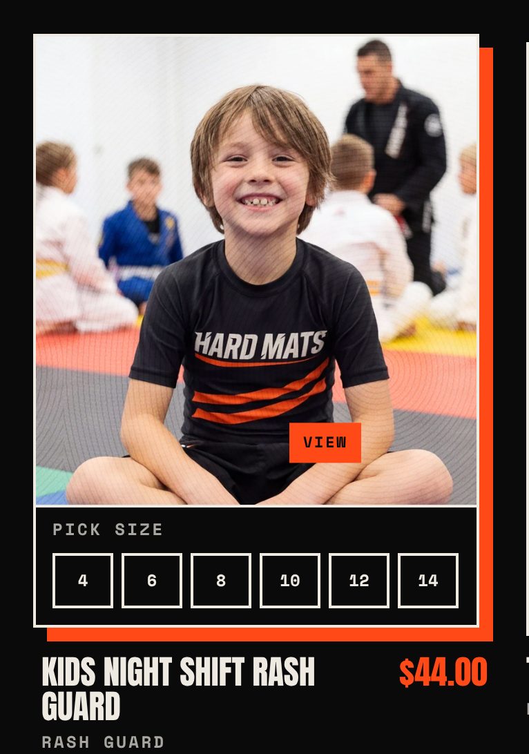
The search results page uses the same filters and also lists matching blog posts and pages.
Cart
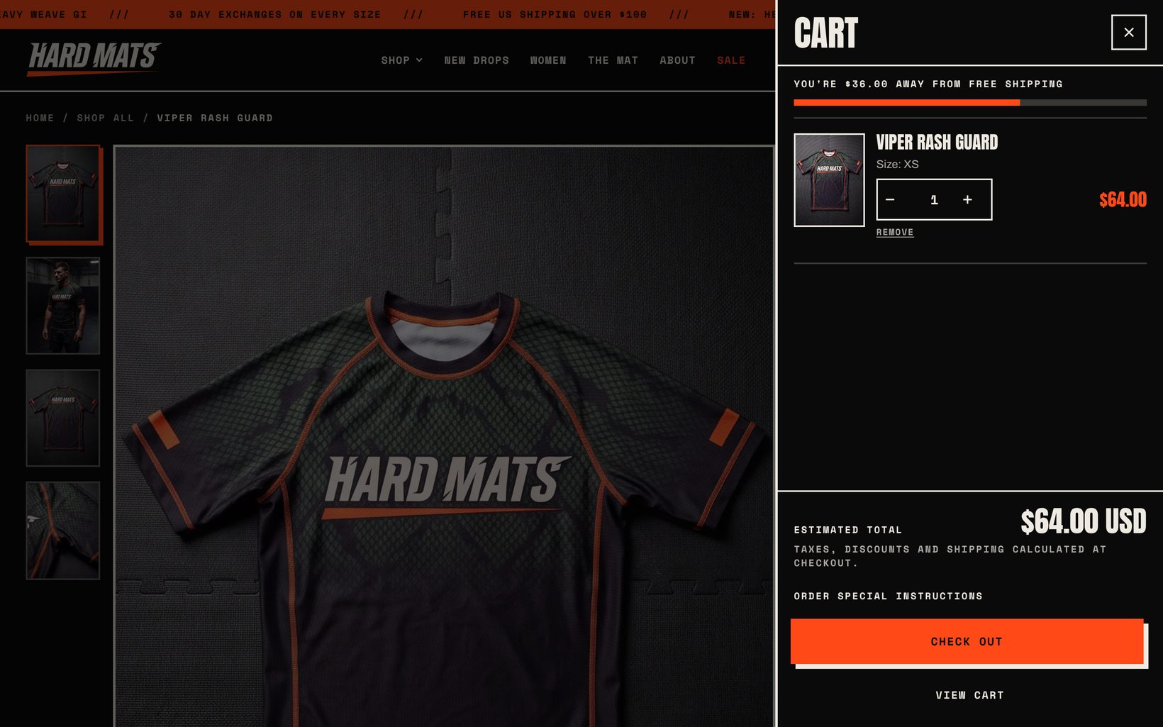
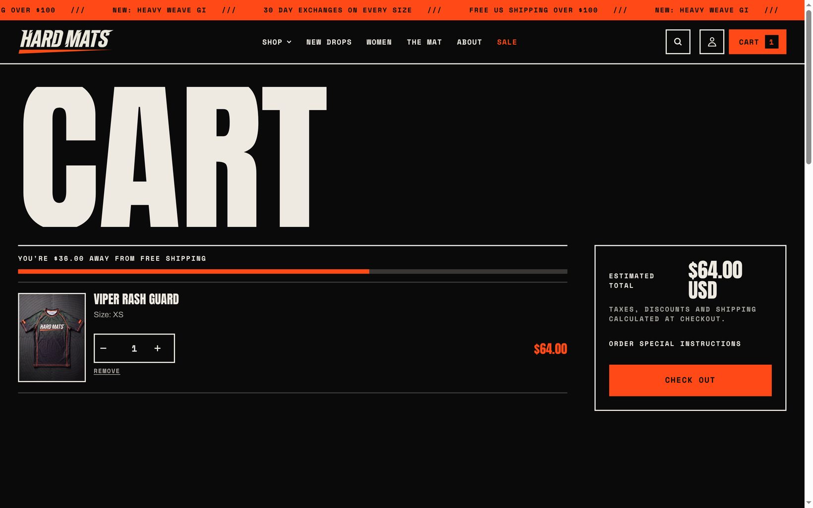
Pick the cart drawer or a full cart page in Theme settings > Cart. Both show line item discounts, order discounts, subscription details, unit prices and quantity rules. The free shipping bar uses the amount you set in your store currency. The cart page also shows accelerated checkout buttons such as Shop Pay, Apple Pay and PayPal.
Blog
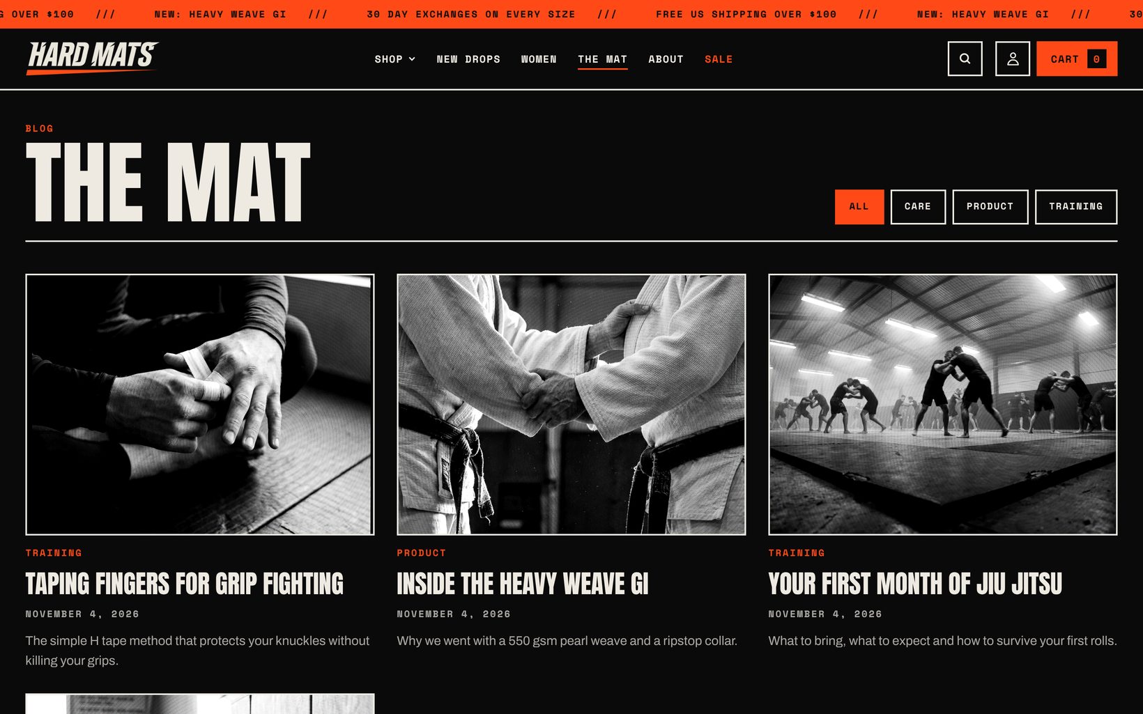
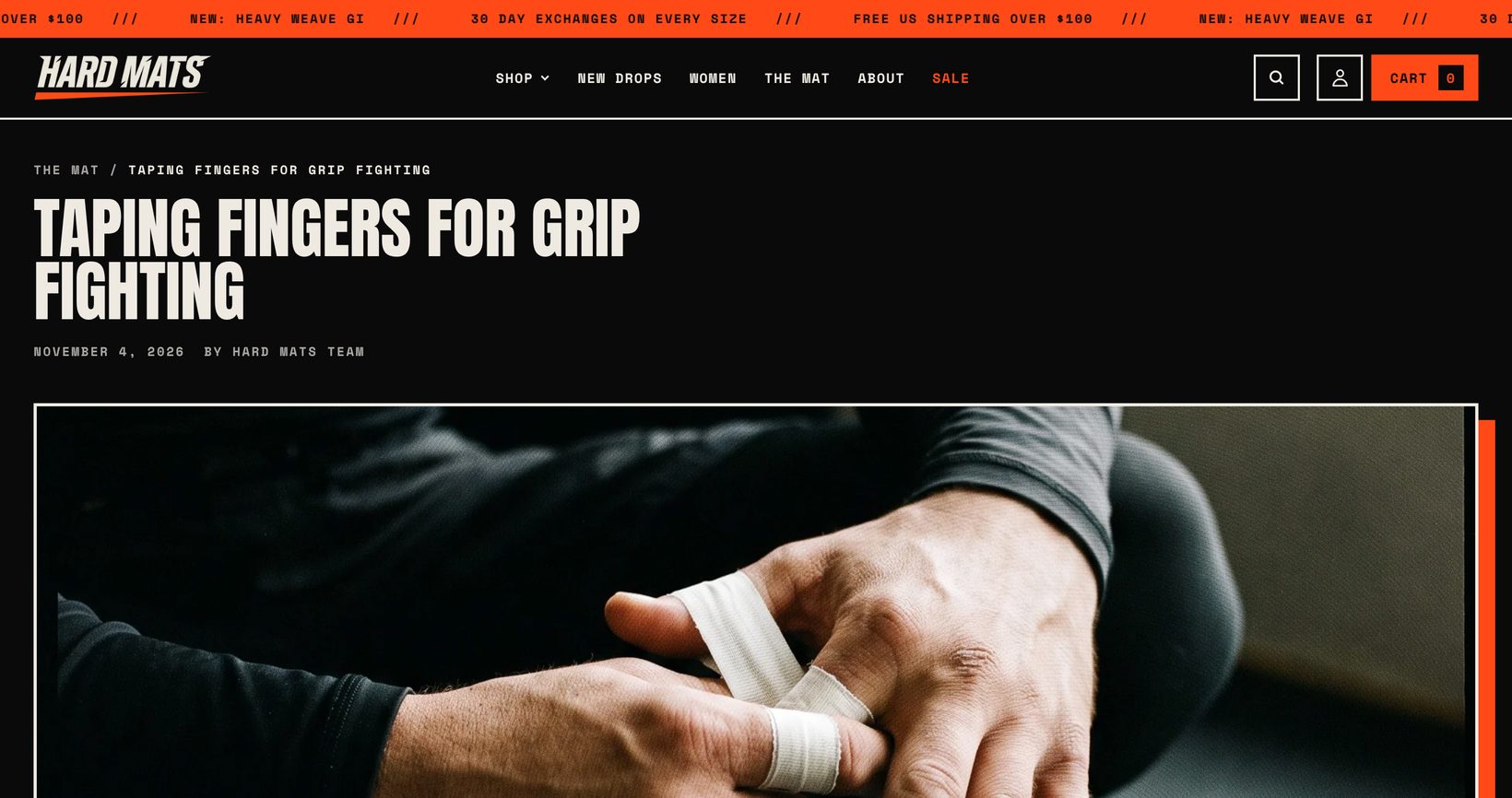
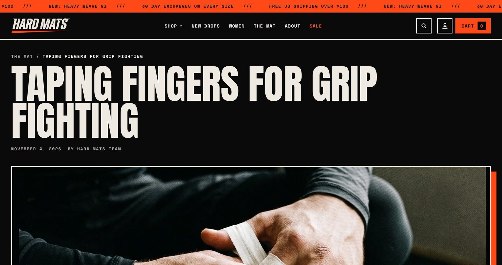
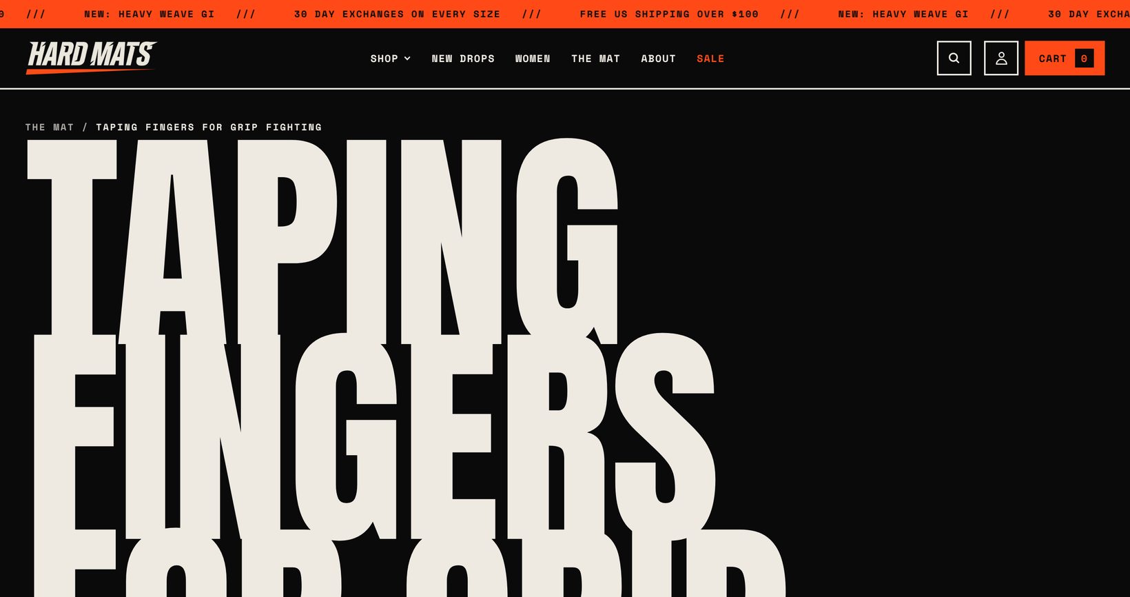
The blog page shows post cards with an optional tag filter and excerpt. The blog, blog post and page templates each have a Title size setting (small, medium or extra large), so long titles stay readable. Blog posts support a featured image, author, tags, sharing and comments. Comments appear when they are turned on for the blog in Online Store > Blog posts > Manage blogs.
Gift cards
Gift card products can include a recipient form so customers can send the card by email on a chosen date with a message. The gift card page shows the balance, the code with a copy button, a QR code for in-store use and an Add to Apple Wallet button.
Languages and markets
All storefront text lives in the theme’s language files. Edit any wording in Online Store > Themes > … > Edit default theme content, or translate with the Translate and Adapt app. Prices follow your markets and currencies automatically.
Animations and performance
Motion is progressive: pages work fully without JavaScript animation, and nothing moves for customers who set reduced motion on their device. If you want a calmer store, turn off Theme settings > Animations > Enable animations. Images are responsive and lazy loaded, and the animation libraries only load when animations are on.
Film grain
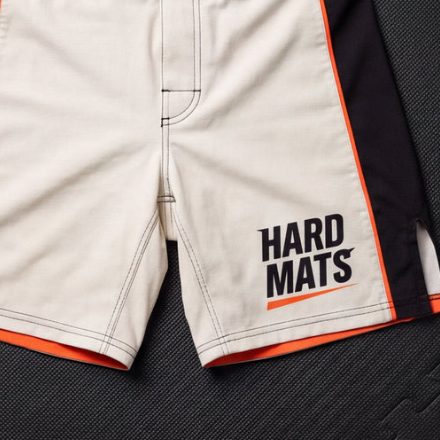
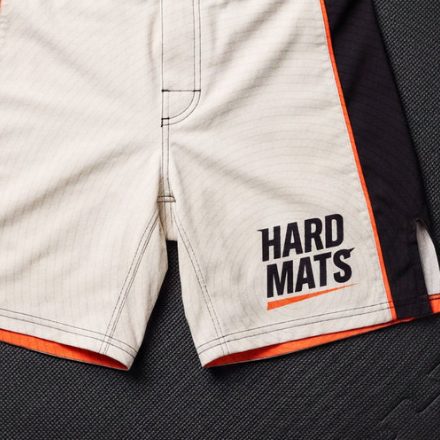
Film grain adds a subtle print texture. Choose Images only (the default) to keep text crisp, Whole page for a stronger look, or turn it off in Theme settings > Animations. The grain moves only when a customer hovers an image.
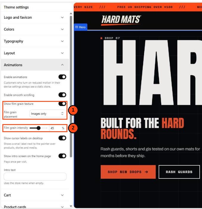
- Show film grain texture and Film grain placement: Images only or Whole page
- Film grain intensity from 10 to 80 percent
FAQ
Can I use Undercard for a store that is not about combat sports?
Yes. The Hard Mats demo is only an example. Every heading, color, font and image can be changed. Undercard suits streetwear, supplements, music merch and any brand with a strong voice.
How do I change the big headline in the hero?
Open the home page in the theme editor, select the Hero section and edit the first and second word settings. Keep them short. One word each works best.
Why do my headlines look different from the demo?
Check Theme settings > Typography. The demo uses Anton for headings with uppercase turned on and a heading scale of 100%.
How do I add color swatches?
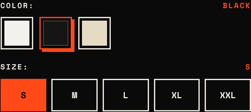
Set a product category in the product admin, then use the Color category metafield for the option. Undercard reads Shopify’s swatch values for the product page and for color filters. No apps or file naming tricks are needed.
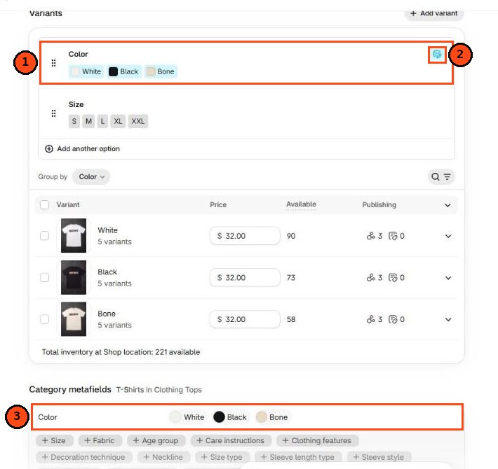
In the product admin, the Color option (1) is linked to the category metafield (2), which you can see under Category metafields (3). Each color value has a swatch color or image, set once in Content > Metaobjects > Color.
The result on the product page:
The quick add button does not show on some products.
Quick add shows one button per size for products with one option and up to 12 variants. Products with more options show a “Choose options” link that opens the product page.
How do I turn off the intro screen?
Go to Theme settings > Animations and turn off Show intro screen on the home page. The intro also only plays once per visit.
Will theme updates overwrite my changes?
No. When an update is released, Shopify adds it as a new copy of the theme with your settings carried over. Code edits you made yourself have to be copied over by hand, so keep a note of them.
How do I get help?
Use the support form. We reply within two business days, Monday to Friday.
Changelog
1.0.0
First release.